|
10:11pm Nov 6 2010 (last edited on 4:21pm Nov 19 2010)
|
 Normal User

Posts: 9,641
|
I hope you understand that my doodles are doodles, and I rarely spend time on them. A couple are just...O___O
And yes, they're pictures. I don't have my scanner with me, so deal. 8u This is the big view. One below is the head's close-up. And him. Omg, I love those eyes. Awesome. I'm in love with her. 8D *o* |
|
1:42am Nov 7 2010
|
 Normal User

Posts: 1,576
|
The first two are my favorites c: Other than those, uhm. O_O That's all I like XD;
|
|
1:43am Nov 7 2010
|
 Normal User

Posts: 6
|
Brilliantly done. I'm loving the sketchy outlook but also the expressive way you draw. It shows a lot about you and I'm honored to have seen these. ^^
|
|
1:43am Nov 7 2010
|
 Normal User

Posts: 531
|
I love the dragon thing~ <333
|
|
1:44am Nov 7 2010
|
 Normal User

Posts: 9,641
|
Like I said, I don't try too hard. The first one...took me an hour. *o* In the middle of the night. That's why the shading sucks.
As for the others? Yeah. xD
Thanks En.
|
|
9:45pm Nov 7 2010
|
 Normal User

Posts: 853
|
Spend more time on things. ._. Also stop saying "sucks" and being unappreciative of your doodles. First things first, they're lovely. I like the dragons. You mentioned your shading "sucks". And despite that you've explained why it isn't so good and such, I am going to spew advice anyway. Cuz you might find it helpful. A good technique when using colored pencils is to use multiple colors. Like for your current color scheme, maybe render using a dark red, light pink and dark green, instead of all red/orange. You did use complementary colors, which is nice. Just a bit more range in value and color would have helped it a lot, I think. For people, gesture sketch. And gesture sketch lots. Better to take long on a good construction than spend time beautifully rendering one that doesn't. I see you already are using circles and shapes for the start of your drawings, which is excellent. Correct and correct again in that phase. Building a good schematic is the hardest part of a drawing, I think. I understand your doodles are doodles, so I hope you don't take offense to this. D: I just want to be helpful.
 |
|
3:53pm Nov 15 2010
|
 Normal User

Posts: 9,641
|
I take no offense, Zombie. 8)
And gesture sketch? I'll try this..but I have no idea what it is. I should work on my humans, but I can usually only ever sum up the energy to finish off my dragons. Because I love drawing dragons. They're fun. ^o^
And yeah, I probably should spend more time on sketching. I shouldn't be giving excuses, but I have a 'weak wrist'. It got messed up after I fractured it and I can't even write with a pencil for more than three minutes. D: I'm going to go draw you something nice when I get home. Just because you gave me some tangible advice.
...
That was some funky verb use there. x)
|
|
11:14pm Nov 16 2010 (last edited on 11:16pm Nov 16 2010)
|
 Normal User

Posts: 853
|
zomby does not deserve any drawings. It kind of surprises me how few know what a gesture sketch is. Truly, there is something wrong with the world today. A gesture sketch is when you quickly draw the form of whatever it is you're drawing without worrying about details. Usually taking less than 30 seconds and using your whole arm to draw. Gesture sketches are usually a.ssociated with a human model, but you can gesture sketch animals and still lives and pretty much anything. My instructor likes to say that the line needs to be free and organic, like ballet. Here are some gesture sketches a Tracy Reynolds did: [x] There are more gesture sketches on her page here. I'd show you some of mine, but they're all in a locker right now. Also, ow on your wrist. D: Get well soon. Don't force yourself to use it too much if it hurts. Drawing can wait. |
|
5:37pm Nov 17 2010
|
 Normal User

Posts: 9,641
|
Neh. It isn't fractured right now. :o It was fractured, and I didn't do anything to help it get fixed up or gain back the muscles, so now it's like...impaired. Or something. I'm not sure how'd you describe it.
And all Zombies deserve doodles. Especially the ones with good advice. :3 I've done gesture sketches. I actually drew a fairly pa.ssable human today after I finished my test in Geo. The heads...off, like usual, but I think I did pretty well on the proportions. Remind me to upload it so I can ask your opinion.
*o*
We have yet to just...draw in art. So far we're drawing lipstick then juxtapositioning it to show what we think of the media and what beauty is defined as today. Ayep, nothing that involves much drawing skills. But shading with pencils is hard. I can shade with pencil crayons though, which is pretty much the same thing. x)
|
|
4:26pm Nov 19 2010 (last edited on 4:29pm Nov 19 2010)
|
 Normal User

Posts: 9,641
|
And all of the ones I was practising today. ^o^ And this here is y favorite paw. Seriously, it was fun to draw. 8D It's a nose. O__O Um...derp monster? I like how he ended up quite nice for me having done a forward view though. :3 And this if for Zombie. :) Every single one of these started as a gesture sketch. Well, excluding the nose, but still. x)
|
|
8:48pm Nov 19 2010 (last edited on 8:49pm Nov 19 2010)
|
 Normal User

Posts: 9,641
|

Wolf anatomy

And more wolf anatomy
These are taken from various DA artists who have made diagrams and such on DA. <3 |
|
11:09pm Nov 19 2010
|
 Normal User

Posts: 6,590
|
Wow, detters!! I didnt know you were an artist *is slow*! I love your style, the derp monster is my favorite, I dont know why, I just like it!
Is Funneh online?: why NO
be back tonight |
|
1:01am Nov 20 2010
|
 Normal User

Posts: 9,641
|
All Det likes about him is the way he actually doesn't look lopsided, or at least, not extremely lopsided, like most of my forward-facing drawings do. :)
|
|
9:09pm Nov 20 2010 (last edited on 9:10pm Nov 20 2010)
|
 Normal User

Posts: 9,641
|
These two are the same wolf, but I fixed him up a little in the second one. He's not done, obviously. Hence the lack of ears, but I'm hoping the leg placement makes more sense now. I just noticed the paws should be evened out a bit more. e.o
|
|
12:02pm Nov 21 2010 (last edited on 12:03pm Nov 21 2010)
|
 Normal User

Posts: 9,641
|

Lol. It's some sort of creature. Might make her a character, but for now she's just some random drawing. >_> She began as a wolf but the anatomy became so skewed there wasn't much I could do to it. |
|
5:39pm Nov 21 2010 (last edited on 5:40pm Nov 21 2010)
|
 Normal User

Posts: 9,641
|

O__O Present for Lathrine, known as Wifey to me, Fluffy and Wishies. Ilu so much. :3
My first time shading on Photoshop. xD The nose is my favorite part.
|
|
4:59pm Nov 22 2010
|
 Normal User

Posts: 520
|
With photoshop, it is best to discover the secrets for yourself, because when you go down the tutorial route you pick up so many mistakes.. Anywho, you're starting out, keep shading with pencil and uncovering the trick to shading yourself (It's very fun. :D) But please, please, please do not go down the route of the Burn and Dodge tool/Blur tool for your shading. It is a mistake many young photoshop beginners get into, and can't get out. Only use when required, NOT FOR SHADING. They will make you look very amateur, sorry, but it's the honest to God truth. Proper use of Blue tool; http://browse.deviantart.com/?qh=§ion=&global=1&q=tooth+and+claw+cover#/d2lt4ev Inproper use of Blur tool; http://oi52.tinypic.com/2gtvrf7.jpg Notice the difference? Just a quick tip. c: |
|
5:45pm Nov 22 2010
|
 Normal User

Posts: 9,641
|
:o
I know. I just dove into photoshop and started experimenting. Them people in the second link look like their souls are escaping. >_>
But yeah...what's this burn and dodge tool? Det was using blur and smudge. O___O Meh, next time Det's gonna do something else. I have no idea how to explain it, but I'm going to take a good long look at the book DragonArt: Evolution, since I admire that shading technique.
Photoshop tutorials are confusing. I wasn't even planning on using them. xD
Thanks Lolbot. :3 I will stop trying to blur everything I see now.
|
|
5:46pm Nov 22 2010
|
 Normal User

Posts: 9,641
|
This is what happens when you get only three hours of sleep. ;c
That post makes no sense. Pfft.
Det hates drawing humans. Omg, why do they look so amazing in my head? D;
|
|
6:22pm Nov 23 2010 (last edited on 6:24pm Nov 23 2010)
|
 Normal User

Posts: 9,641
|
Progressive stages...
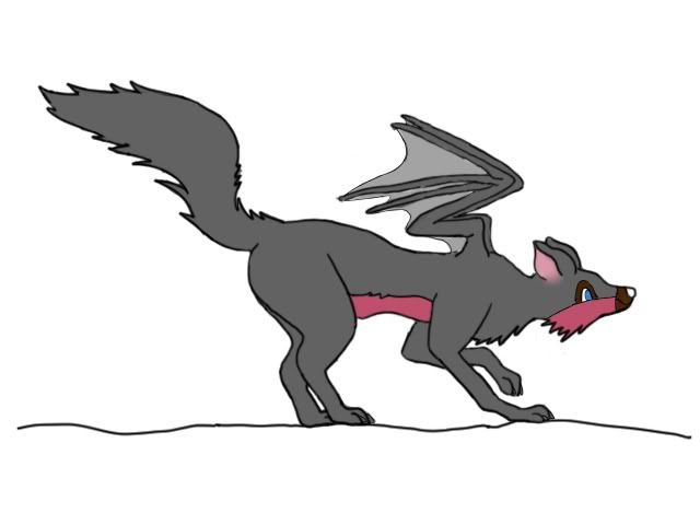
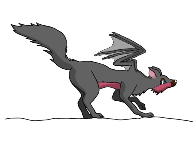
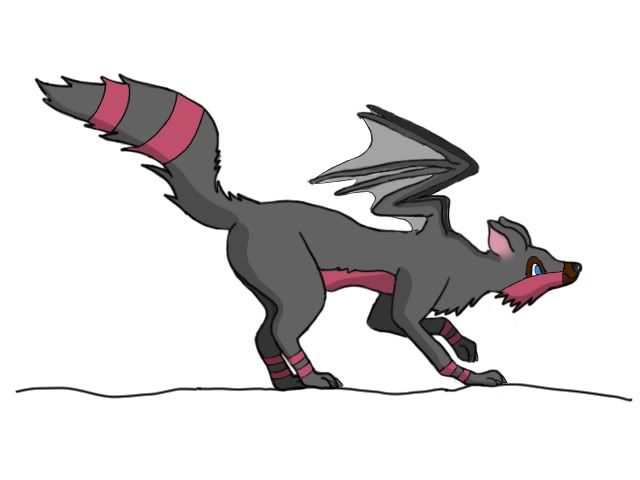
And if you can't tell, Det added in the markings after she did everything else. She's a derphead. She knows. ;c
...
But she stopped blurring everything. 8D |
|