Traditional Sketches - Price Check/Critiques Needed!


Go to page: 1 Bookmark Thread
Meelanya

12:20pm Sep 9 2011

Normal User


Posts: 2,194


I have a tablet, but I'm such a noob with it! D:< I tried to digitalized the examples below, but they looked like crap.
So anyways, I think I'll just stand with traditional, unless someone wants to teach me how to draw digitally! xD

So, these are my more recent sketches. I haven't drawn in years .. so yeah .. be honest.
I will take every critique and/or advice you can give me! c:
Also, if you could just give me a price check on them, that would be awesome!

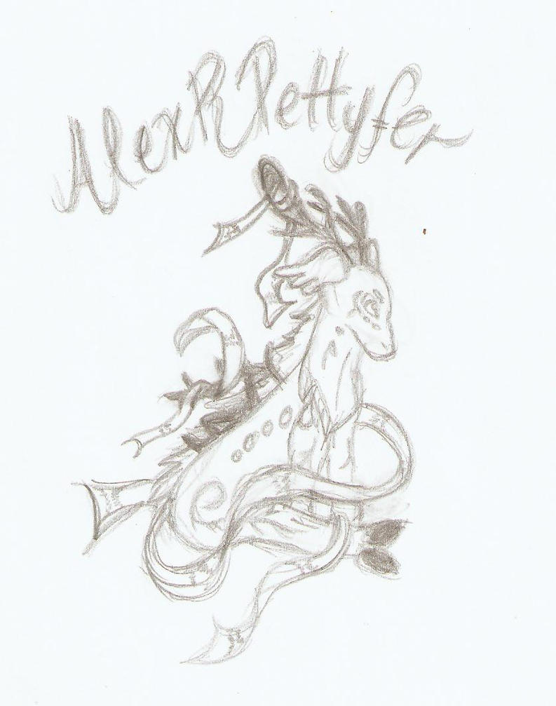


Wolf

3:11am Sep 16 2011

Normal User


Posts: 756
Nice pieces of art you have there, Mee~ I'll have a go at the critique part, as i'm not good at pricing d:

1st drawing:

I like the pose of the girl, and the way that you sketched her outline. Though I can't draw humans at all, I think it's very good! d:

I do have some critique about the meragon though. First off, the nice stuff. I like the way you positioned the wings and drew most of the details for it. c: But...

- Face/Head: Try and make the face have more shape, right now it looks rather bland. [Also, I suggest you try and add in a nose and a mouth? o.o]

- Ears: Should be smaller, as horse's ears are much smaller than half of their face. At the moment, your meragon's ears are the size of half of its face ! xD

- Legs: The legs should not be so stubby and short. Horse's legs should be lean and long - Try and use a reference for your drawings! It helps loads <3


- Hooves: Naturally, hooves aren't square. I used to draw them like that too, until I saw a picture of a real horse and saw that they actually have a sort of trapezium-like shape. Here's an example:


- Chest: Right now, the meragon does not have a chest. All creatures have them, and it looks as if your horse's neck-line is going straight down~ I suggest you add a bit of a bulge near the end of the neck?

2nd Drawing:

Nicely done. Again, I like the pose of the kioka and see? This kioka's head shape is much nicer than the meragon's. You should work on emulating the anatomy of the creatures or at least referring to their pictures while drawing. That way, you won't go off track on their anatomies and details. c: For this drawing, I only have one criticism.

- Back: The kioka's back should have a curve in it, as the back also indicates where the legs are on the kioka.


Meelanya

8:56am Sep 16 2011

Normal User


Posts: 2,194


Thanks a bunch Dragwolf!!! I'll work on these things! :D


Go to page: 1