Okay, so a critique.�
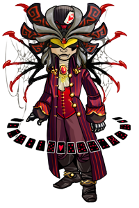
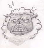
They're fairly good... but for the first one you need more depth.� The picture is rather shallow.
The second one is good as well, but the cheeks on the girl seem a little fat considering she's skinny.
The eye is very nice, but it lacks the striations a normal eye does, and its extremely shiney.
The next one... well I think the nose and mouth should be better defined.� Not sure if its a girl or a cat, or a mix the way its drawn.� And the eyes are enormous.
The next one... those eyes frankly scare me.� They're far too large for one, and all I can see is an iris with hardly any pupil.� The positioning of the body is good though.
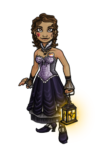
The sports girl is good, except again, the eyes are large and remind me of the term "blonde bimbo."� Empty looking, in other words.� And they don't match... the left eye is shorter than the right eye by a good amount.
The girl on the graph paper is nice, but the eyes are too large, even for anime style, which I think is the effect you're going for.� Its also off because the positioning of the eyes for the cheekbones, which are rather sharp.� Arms are far to straight for being behind her back, they should be bent at least slightly, and the nose and mouth need repositioning and better definition.
�
Okay, you asked for a critique... here's a small one for each picture.� Overall, they're good.� Keep practicing tho!
 Normal User


 \r\nAwesome.tastic siggy by Mindii. <3
 Normal User

 Normal User

 Normal User


 Normal User
 Normal User
 Normal User
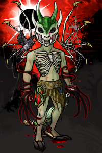 Normal User


 Normal User


 tle="Wink" />
 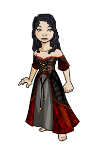 Normal User


 Normal User